Spaceman Studio
Website
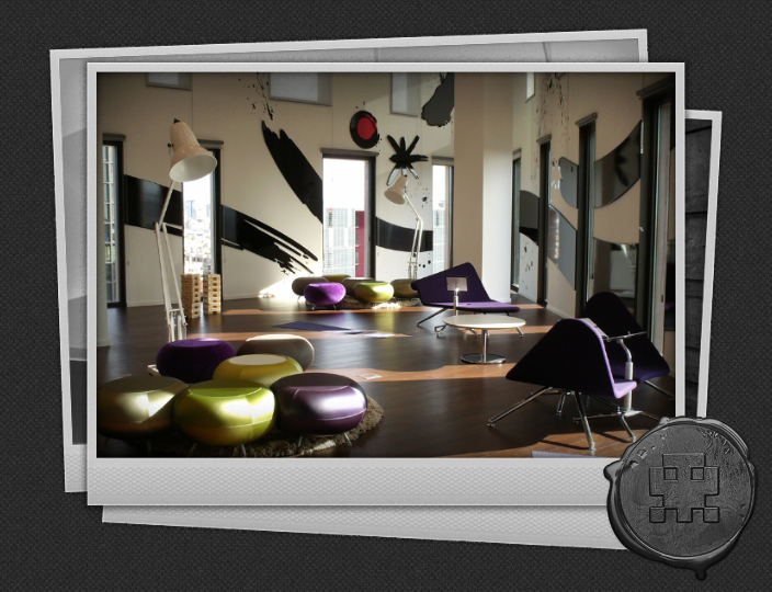
New website for interior graphics specialist Spaceman Studio. Mostly black and white and tones of grey, the site has a restrained, sophisticated appearance. Hovering the greyscale project thumbnails reveals a full colour version, which adds focus and a splash of colour. The logo animates on hover, using the steps() option of the new CSS animations. Essentially it’s a stop frame animation of a single sprite; nice and neat. Vignetting is applied to the Polaroid images using CSS box-image-mask. The site can be updated by Spaceman Studios via an easy to learn content management system, so that projects can be added regularly.
© Andrew Fairhurst 2011
Credits:
Content Preparation / Upload : Ana Grigorovici
Posted in: Design > Website Design
09/12/2011
